Real Estate in Review: Why Your Signboards Aren’t Working
5 July 2024

Steve Osborn
Managing Director, Identity Marketing
After more than a decade of creating real estate brands, I can tell you agencies and brands often put too much emphasis on what a signboard can do. They see it as an all encompassing workhorse capable of selling a house, promoting a brand, driving web traffic, promoting an agent’s personal brand, cementing your place in the community, making you breakfast in bed, and so on.
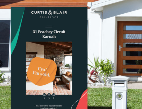
In truth, signboards have three utility functions. For buyers, it lets them know they are at the right home. For agencies, it’s a low-cost outdoor ad to create awareness. And, for agents, it’s an opportunity to capture leads. These are the three functions that should be prioritised. If you’re doing more than that, you’re setting yourself up for failure. Keeping this in mind, I’ve put together a handy guide on getting the most out of your boards.
What to Include
Brand Assets
Your most defining brand assets should be on the board. That might be a colour, a pattern, a slogan, a tagline, or a shape. If there is one asset consumers know you for it should be on your signboard.
When it comes to luxury colours, consumers don’t make the mental leap between understanding that black signboards are for luxury properties and blue signboards are for standard properties. Make them all luxury! If you want an expensive option, make the board bigger.
Logos (at the Top)
I would argue 90 percent of the time your logo should be at the top. To prove this point, all you need to do is park an SUV in front of a signboard. If your logo isn’t at the top, someone might not know that a low-cost outdoor ad is for your brand. If you’d like to go the route of placing it elsewhere (as we’ve done for brands in the past as well), you better be damn sure your assets are distinctly recognisable enough that Mazda CX-5 isn’t going to stop your brand being recognised.
Correct Brand Colours
Colours and printing is less of an art and more of science. There are so many variables that come into play (in fact, we have a whole post about it on the IDM website). To summarise: Don’t use different printing suppliers. Spend time working with your printer upfront to get the colour right and ask them to visually match your brand colour each time they print a board, you’ll have the right colour for years to come.

What Not to Include
QR Codes
Alright, so you’re up to speed on what to prioritise. Let’s look at what you can do without. Let’s start with QR codes. The purpose of a signboard isn’t to act as a device to drive traffic to a website. In fact, a QR code only solves the problem of someone walking past typing the address into Google, which, let’s face it, googling an address is often easier than using a QR Code. Everyone attending the open probably saw the listing online somewhere, and people driving past are not checking or scanning your QR code.
Email Addresses
Similarly, have you ever stopped at an outdoor ad and sent an email to someone from it? If you answer no, take your email address off the board. You have to think about it this way: anything that isn’t 100 percent required is distracting people from the first function of the board, to sell the property.
Agent Photos
While we’re looking into agent details, more often than not the agent photo is unnecessary for boards. Yes, agents will tell you they’re needed for personal branding. But these same agents will more than likely not spend money on outdoor ads like bus-stop ads, instead pumping money into social media ads. My opinion is that money speaks. If agents truly believed this, we’d see more outdoor agent-funded ads.
How to Stand out From the Competition
Don’t Be Them
I’ve been told so many times that people want signboards like Whitefox (and it’s easy to understand why). But not once have we given them an arch, ‘window’ to look through, or board that proudly states ‘the deal’. Why? Because it doesn’t represent their brand or their values. Instead, we create something that is unique to them.
If you’re copying another brand, everyone in the industry will know. And it will hurt. It’ll hurt your brand’s integrity, your ability to recruit, and your ability to stand on your own feet. People want to work with the original – not the clone.
Just Be You
Print off your board and your competitors’ boards. Now cover the logos. If they look too similar, that’s a problem because people are driving past these boards every day and the logos blend into the background. Refer back to your brand assets, what do you have that no one else does? That’s your leverage.
Looking for some creative inspiration to reinvent your boards? Have a look at our piece on some of the best boards in the industry.