A Case Study: Elders Real Estate
26 March 2024

Written by Acme Mag
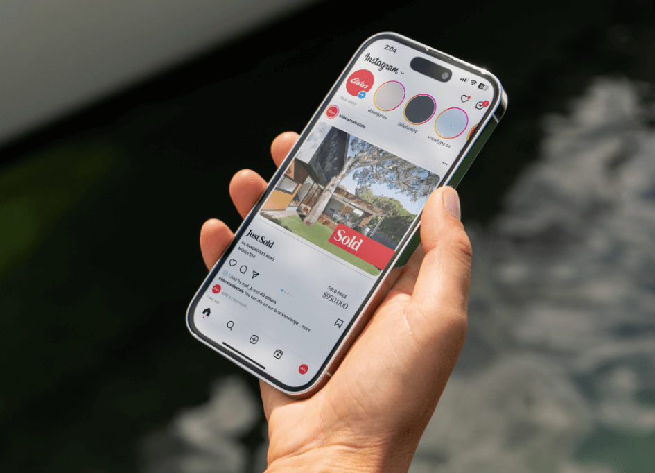
As Elders Real Estate celebrate their 185th year anniversary, they’ve begun rolling out a refresh of their brand. Well recognised as Australia’s leading rural real estate agency, Elders has 300 offices across metro and regional Australia, making them one of Australia’s largest residential brands.
Working alongside Identity Marketing the brand has introduced new assets and elements to give them the flexibility to grow even further as a business. Elders General Manager Brand and Residential Real Estate, Belinda Connor tells us how the goal for this brand refresh was to further grow the recognition of Elders.
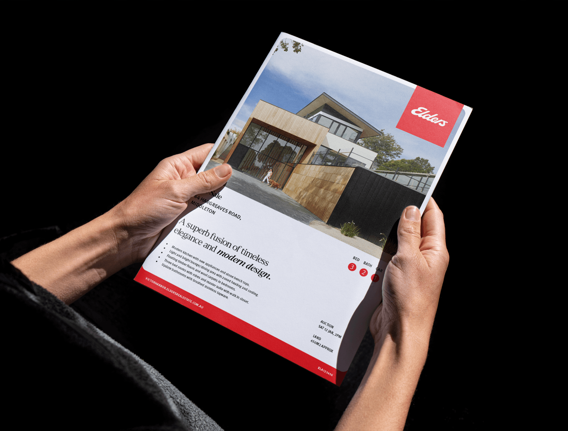
“It is important that the refreshed brand can adapt to all regions, while maintaining the cohesiveness of the Elders brand,” Belinda says, “the refreshed look is a nod to the strength and history of the Elders brand, while also perfectly positioning our residential real estate arm for an exciting future ahead.”
Although the brand refresh has introduced new aspects, the distinct Elders script logo and vibrant red remains unchanged. To refine, modernise and streamline the way the logo is used, it has been moved outside of the key-line box in certain strategic deliverables such as the new iconic signboards. Elders Real Estate Marketing Manager Krystal Ind the current brand had served its purpose, but certain elements needed to evolve.

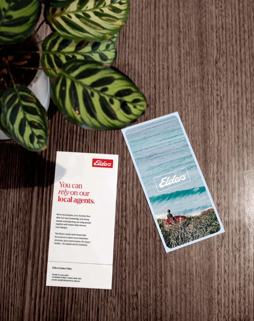
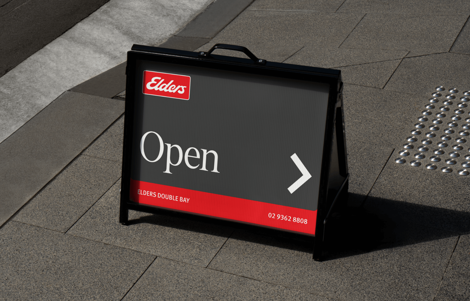
“Over time, like many other brands, our in-market presence no longer reflected who we are, nor offered our agents the flexibility to highly personalise materials in their local regions. With substantial growth over the past decade and our strategic vision for the future, it became imperative to realign our brand accordingly,” says Krystal.
“To pay homage to the Elders’ history, a serif font has been introduced. This conveys a subtle retro undertone, whilst remaining modern and current. The serif font is flexible and can be used in many font variations. With this, agencies can use typography to make the new Elders branding their own.”
Identity Marketing Senior Designer Bianca Sawyer says as the logo has been moved out of the box, the team wanted to incorporate the distinctive rounded shape in a different way.
“A curved box is used to create borders and inject colour. This versatile shape is a common link throughout each design, which ties the brand together. As it’s a simple, usable shape, it’s easy to implement across all offices,” says Bianca.
Lead Designer
Bianca Sawyer
Studio
Identity Marketing
“The feedback from our network has been overwhelmingly positive. Agents across the country in all different regions have embraced the new branding and materials. We’ve had overwhelming commentary, both internally and from industry that the new branding rivals if not exceeds that of our competitors and supports Elders for future growth,” says Krystal.
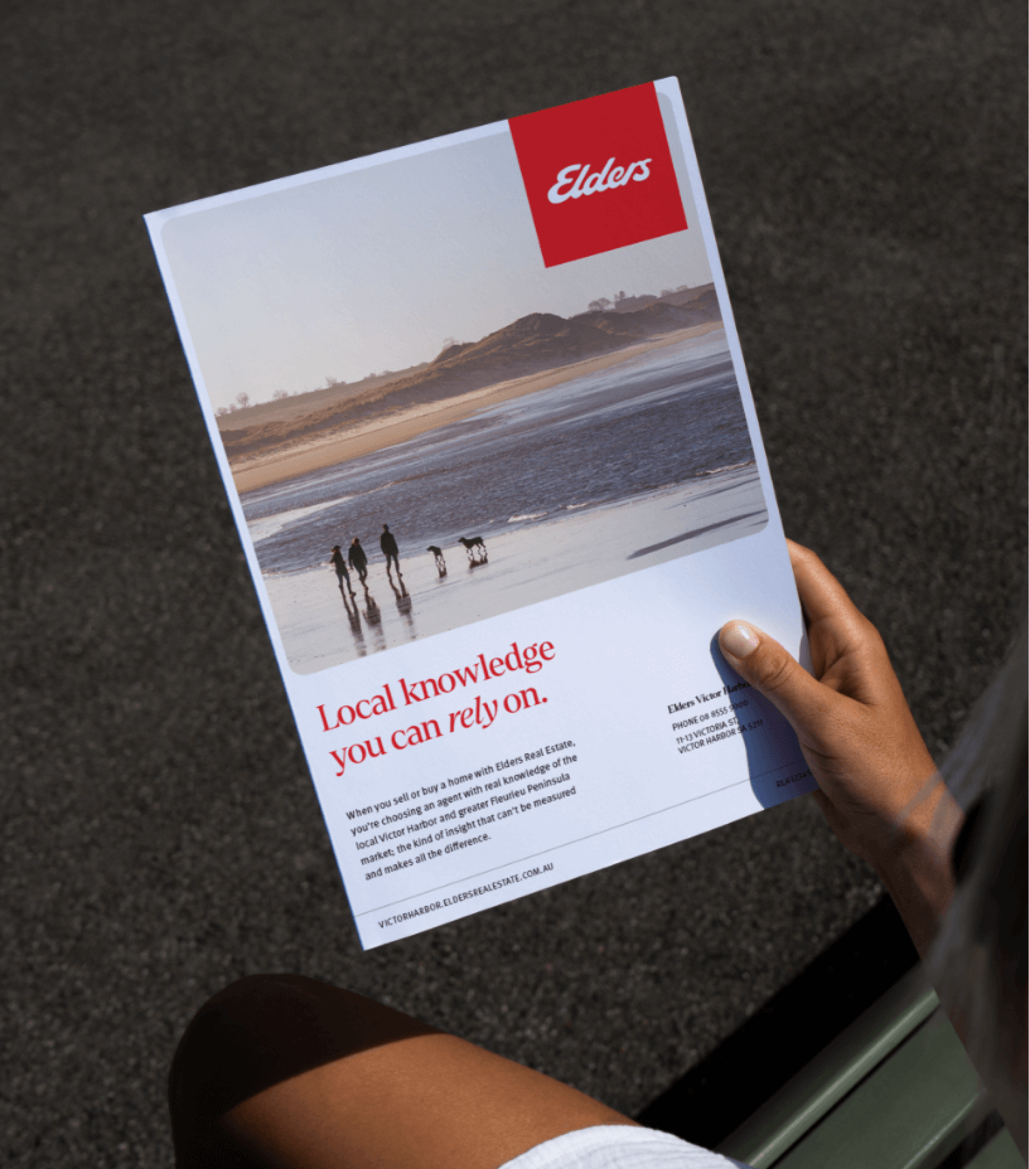
Elders Real Estate’s key point of difference is that they are proven to be the most trusted agency in Australia. The word rely is synonymous with trust and is the common theme used throughout the messaging. The overarching slogan, ‘You can rely on us’ shows that the community can depend on an Elders agent to take care of their home with the backing of an established, national company. The sub-messaging has been adapted to suit individual offices whilst consistently using the word ‘rely’.
On working with the Identity Marketing team, Krystal says the whole process has been a great collaborative experience. The team helped not only bring Krystal’s ideas to life, but also add and expand onto them.
“The ideation during the concept phase clearly demonstrated how we could modernize our brand while adhering to Elders’ overarching corporate guidelines. They adopted a collaborative approach, actively incorporating feedback to ensure alignment with our Elders corporate brand,” says Krystal.
“Personally, they felt like an extension of our team – taking on, advising and running critical projects within the scope that we didn’t have resourcing for. I remember the head designer running back to their office to grab staging materials when the house we hired for a photoshoot wasn’t in the same condition it was presented in for hire – so their attention to detail was always excellent.”
If you’re interested in seeing more work for Identity Marketing, you can check our case study on Nicholls & Co here.
For the rest of 2023, Nicholls and Co is looking to use marketing to empower people moving forward. This means both clients and team members alike.
“We’re looking at empowering everyone in the team to look at everything we do in terms of marketing, processes, and admin, and always thinking if there is a better way to do things. We all have the power to innovate if we apply a different way of thinking.”
