Expand Your Horizons
9 December 2020

Written by Acme Mag
A deep dive into the real estate industry’s obsession with primary colours.
If we asked you to envision Australia’s biggest real estate brands, which brand colours come to mind?
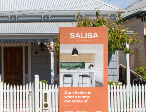
We’re willing to bet big that you thought of the following colours: Red, Blue and Yellow. More specifically fire-engine red, cobalt and navy blue, followed by sunshine yellow. Of course, there are exceptions to this rule, such as Belle Property’s distinctive shade of green, but for the majority, real estate is characterised by three overused colours.
Colour psychology has been a big driver in the selection of shades for real estate brands and to a point, this was effective. Red is said to cause excitement, blue is said to encourage trust and yellow is said to be uplifting – all of these being positive when you’re dealing with someone’s biggest asset and decision in life. As the real estate industry has grown and so too has the number of real estate brands, colour psychology is no longer a driver of success, rather differentiation from the competition is.
The eye can see an estimated 10 million shades, composed of 11 main colours: red, orange, yellow, green, blue, purple, pink, brown, gray, black and white. So the question has to be asked, why are so many real estate professionals who are looking to begin their own real estate brand considering the same three overused shades? Identity Marketing, a marketing and creative agency that has a longstanding relationship with the real estate industry shares some insight into this.
“The little guys want to emulate the big brands in real estate to align themselves with the trust and reputation associated with them, this usually results in sticking with primary colours that reflect these big brands” says Ben Fleming, a Lead Designer with Identity Marketing.
“I’ve noticed that these colours feel safe for people because they’re common. Branding is a big decision that you’ll see every day, so I can’t blame them for that choice” adds Jade Thesiera, one of Identity Marketing’s key brand aligners.
It seems that whatever the reason, familiarity or personal preference, these colours just don’t have the same sway they used to. Naturally there are a multiple of other variables that go into branding and making a brand unique, however colour is a big player therefore colour choice needs to expand in real estate professionals looking to carve out their own place in the real estate industry.
If you’re on the path to beginning your own real estate brand (or if you’re beginning to entertain the idea) you should start by working with a designer who can develop something different and introduce you to new colours, concepts, styles and ideas. It’s this ‘expansion’ of your creative horizon that is key to creating a real estate brand that will be remembered by your market.