The DL on Design: Roofs, Keys & Houses
3 December 2019

Bianca Sawyer
Lead Designer, Identity Marketing
Firstly, let me stress the importance of a logo. Similar to today’s dating scene, your brand will be judged on its initial appearance. When seeing a brand (or future spouse) for the first time, you ask yourself these key questions: Are they someone I want to get involved with? Do they have a personality? Can I depend on them?
If first impressions don’t tick these boxes, you move on.
Now that we have the importance covered, I’m going to let you in on some industry secrets on how you can achieve a great first impression that can assist in generating business.
Humans are curious beings. We all have a desire to learn more, gain information and be knowledgeable. Back to the online dating analogy, with a dating profile you get a couple of photos and maybe a small bio. As curious human beings, we want to know more before making a decision to contact. We search for more answers where we can with Instagram, Facebook and possibly a cheeky Google search.
What if I told you that you could harness this kind of curiosity to generate leads, sales and awareness? When a consumer is faced with a logo that is cleverly designed, intriguing and a little bit mysterious, they naturally want to know more. This leads people to interact with your brand. Think, clicks on your website, hits on your socials and interest in your print marketing. To put it simply, if the first impression is that you offer a unique and streamlined consumer experience, it’s very likely to result in conversations, interaction, leads and brand awareness.
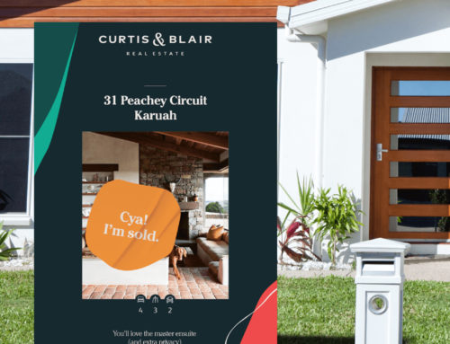
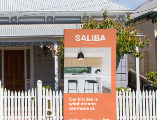
To avoid rejection in the crowded real estate industry, you need to avoid literal logos. Literal logos represent what a company’s service or product is rather than its deeper meaning, unique point of view and ‘personality’. For example, I see far too many real estate companies using a roof, key or house icon as their logo. Although many consider this approach logical, it says nothing about the underlying experience of using your agency. Furthermore, roofs, keys and houses are not unique to the real estate industry, there are a legion of builders, locksmiths and mortgage brokers using similar (detrimental) imagery in their logo.
Let me give you an example of a global business that is widely recognised for context. Nike, the world’s largest supplier of athletic shoes and apparel, initially set out with the sole purpose of producing sports shoes. In 1969 the company hired a student graphic designer to design them a logo. Instead of looking at the company’s core product, the designer found inspiration in the company’s purpose. Representing movement, speed and being active, the fluid shape of the Nike swish was born. The designer looked beyond the merchandise, in turn allowing Nike to sell more than just shoes over the years. The Nike logo, whilst not literal, represents the companies culture to inspire and motivate humans to be athletes. It’s the meaning behind the face — and it’s legendary.
It’s time to stop being anxious at the prospect of using something unique, cleverly designed and a tad mysterious. So, take the time to think about what sets you apart from your competitors and harness this to your advantage. Before I get back to designing magic for my clients, I’d like to leave you with some food for thought in the form of a quote:
“I can write the word ‘dog’ with any typeface and it doesn’t have to look like a dog. But there are people that think that when they write ‘dog’ it should bark.”
Massimo Vignelli – Italian designer