A Case Study: More Estate Agents
14 December 2019

Written by Acme Mag
Established in 2016 by Michael Devlin, More Estate Agents is an independent agency operating in Jindalee, South-West of Brisbane.
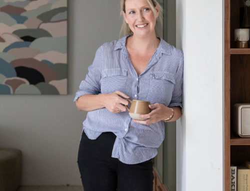
Within months of owning his own agency, Devlin was listed as Rate My Agent’s most recommended agent in the area, credit to the many loyal buyers and sellers who loved his work and endorsed him. Not just the face of More Estate Agents, Devlin is also an iconic member of his local community known for volunteering his time to cook for the homeless and sponsoring many local events.
Proving himself as one of Jindalee’s leading agents with an established name for himself and his brand, Devlin noticed some inconsistencies with his marketing collateral. His well earned and outstanding reputation was being misinterpreted and confused as no two pieces presented the same branding…
With a unique approach to selling, the agency was lacking what many long for — a brand presence that stands out in a competitive marketplace which can be relayed through an array of marketing deliverables.

“The agency was lacking what many long for — a brand presence that stands out.”
The Decision
The ‘More’ branding had a strong foundation to begin with, which is why a brand refresh, rather than a whole new branding concept was decided upon. As it stood, the company’s branding was simple, yet inconsistent. In short — the brand did not flow from letterhead to local report.


“It was time to relay the new image of who More is on a variety of mediums.”
The Process
The decision to stay dark was concrete when researching the competitors in the Jindalee area, however the original More blue was muted to add softness where there was none before.
The More logo, as it stood pre-refresh, was never one and the same, in font choice, style or layout. The designers of Identity Marketing made the choice to upgrade an existing version, choosing a geometric sans-serif typeface with a variety of weights great for publication. The refreshed ‘More’ text is bolder, strengthening the presence of branding and complementing the ‘estate agents’ type being lighter. Encased together in a perfectly weighted boundary, the new logo is pleasing to the eye with proper hierarchy, more than just text in a box.
The slogan, ‘we achieve more’ replaced Devlin’s original ‘I got them more’ for a lighter approach, appearing sparingly on marketing collateral.
With the new brand established, it was time to relay the new image of who More is on a variety of mediums, from print to digital and even billboard advertising.
The roll out of More Estate Agents fresh face happened quickly, with visual assets such as business cards and email signatures being created almost instantly for a quick change over.
Devlin’s Sales Pre-Listing Kit received an extreme makeover, keeping essential information in the forefront, but with a whole new user experience.
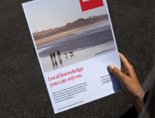
A new Local Report was also introduced into Devlin’s repertoire, positioning him as an expert in his maarket. Identity Marketing’s designers pushed the boundaries with a fresh and modern look proving reports don’t have to be basic.
As a whole, the team at Identity Marketing alongside Michael Devlin, took More Estate Agents branding to a new level.


Lead Designer
Mollie Barker
Content Designer
Bianca Sawyer